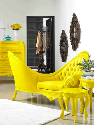
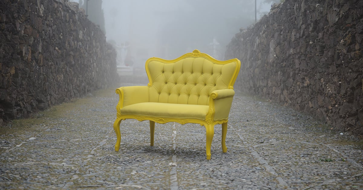
If we ask you to think about the ideal color to combat the emotional uncertainty and fear that inevitably invades many of us before 2021, what would it be?
Well, the Pantone experts have already anticipated and, as every year, they reveal to us what the official color of 2021 will be, and the surprise is that it will not be one, but two: Illuminating Yellow and Ultimate Gray.
The decision to give prominence to two colors simultaneously was surprising but not new: the same happened in 2016 when serenity blue and quartz rose were mixed as a way to honor gender equality.
However, this year the colors chosen do not mix with each other, but rather work together to transmit a complex emotional message designed precisely to raise spirits and combat any remaining negativity that 2020 has left us.
Illuminating 13-0647 and Ultimate Gray 17-5104 What's so special about them?
No designer can doubt the psychological force that colors have in our way of perceiving and interpreting the world. In tough times, surrounding ourselves with the right colors can help keep us upbeat, upbeat, and full of energy.
To choose the color of the year, Pantone draws on a panel of forty experts from around the world who carefully observe the evolutions of color in all things around us and in the social climate. Sure this is clearly a marketing strategy, but it has worked so well that it always manages to set trends in fashion, design, and architecture. So we can expect a 2021 filled with vibrant yellows and solid grays, but why?
More than ever, this coming year we need emotional support and hope, which is why a combination of colors was chosen that transmit very different things but that achieve a very interesting synergy from a contrast that evokes balance, flexibility and practicality:
Illuminating 13-0647
It transmits: Optimism, energy, hope, positivity, health, youth, warmth, friendship, gratitude, encouragement and happiness.
Ultimate gray 17-5104
It transmits: Solidity, security, continuity, strength, stability, tranquility, professionalism, certainty, reflexivity, peace, durability, firmness and composure.
For those who are not fans of either color, it is clear that yellow by itself can be a bit garish and aggressive, even stressful, while gray undoubtedly becomes boring or depressing. But together they project the best of both and are balanced to generate an atmosphere that transmits positive energy, and also tranquility and confidence in the future.

Now, it is important to note that, although we will undoubtedly see a lot of these colors in residential, commercial and urban design proposals for the coming year, we can also generalize without fear and simply opt for combinations between light neutral base tones and contrasts in tones. bright colors from the pastel range.
Remember that, if it is about accessories and furniture, you can complement your design proposals with the unique and 100% customizable pieces of POLaRT Y Polrey, which will make it much easier for you to integrate accents in vibrant colors to sober and quiet spaces, achieving precisely the effect how much we are going to need next year.
Are you ready to make the best decoration and interior design proposals? Subscribe to our newsletter and start a new stage with the right foot and all the value of our content designed especially for you.


Leave Comment