The most avant-garde showcases no longer pursue the simple objective of displaying the product on a pedestal, nor of perfectly aligning a row of rigid mannequins. Thanks to years of learning in human psychology and marketing, today we know that sideboards must be able to tell a story, because stories convey emotions, evoke sensations and in general, provoke a response of strong identification and influence.
This commitment to the emotional is no coincidence, and if you dedicate yourself to marketing, it is most likely that it sounds very familiar to you, since it is a constant in all its branches, and retail is no exception.
Telling a story is easy when you can use audiovisual resources, but how can you do it with static elements? Is it really possible?
The answer is yes, and here we will tell you how to do it.
Practical guide to designing a showcase that captivates looks:
Before you start thinking like a designer, you have to think like a potential client. Try to remember when was the last time a showcase caught your eye and genuinely piqued your interest?
Some showcases draw attention to the huge signs in colors that are difficult to ignore - and digest - that promise sales and purchases for months without interest, but nothing more.
If you do a count, chances are that the few sideboards that have caught your eye have something in common: the originality and creativity of presenting the products in a way that makes you want to stop, observe and enjoy.
When we start to dissect the creative process behind these good examples of sideboards, we can distinguish five fundamental steps:
1.- Choose a theme and a concept.
As in other creative exercises, the first step is conceptualization. That is, what will be the main theme and what will be the "twist" or creative approach that you will use.
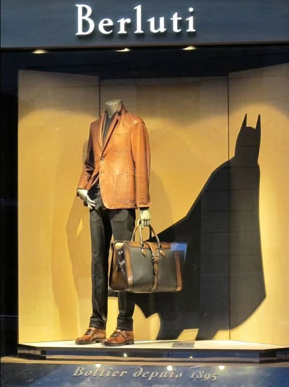
For example, if you wanted to design a showcase for Father's Day, the theme is quite obvious, but the creative approach or concept can be quite varied. Let's start from the fact that, for many people, the father is the first superhero of their life.
Taking advantage of this emotional relationship is an excellent idea, as this magnificent display case from Berluti shows.
No matter what time of year you are, there will always be seasonal themes. In fact, most of the retail industry recognizes between 13 and 20 seasons a year between local festivities and traditions, so there will always be a theme to choose from.
2.- Design a scene
Once you have a theme and concept, it's time to get out pencils and paper and start sketching. At this stage you must make a sketch of a vignette or scene, that is, a representation of a moment frozen in time.
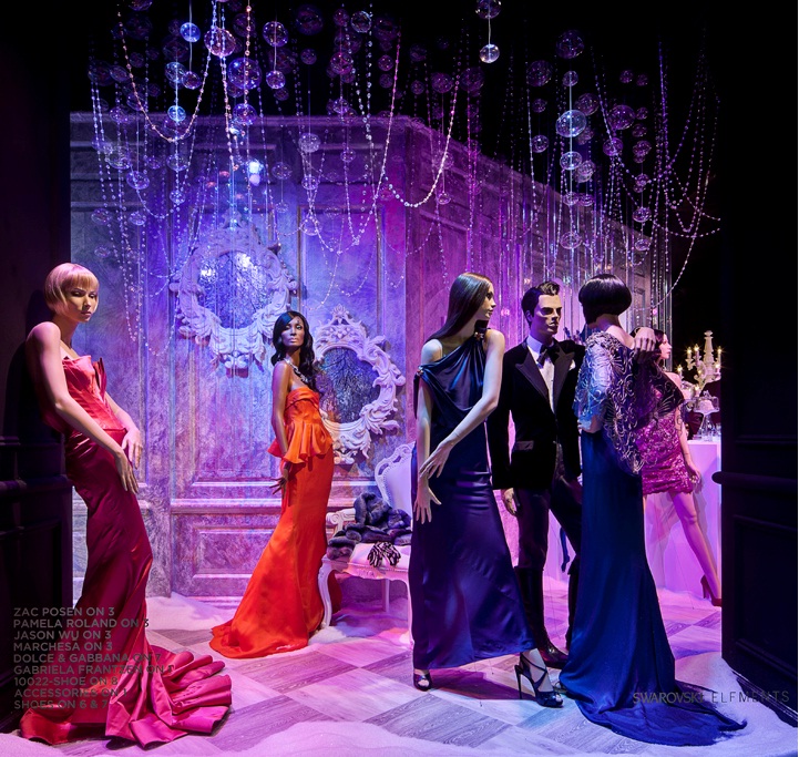
It is important to understand that the objective of a showcase is not so much to promote the product, but to capture the attention of the public and attract them, offer them something that is enjoyable to see and that, ultimately, invites them to come to the store.
Therefore, you can be as original as you like, and use any visual style that you like, you just have to make sure you are original and avoid falling into clichés at all costs.
3.-Choose furniture that catches the eye
In most cases, creating a scene requires certain objects as decoration to structure it, and this almost always means using furniture.
But here you face a rather peculiar dilemma: on one hand, the furniture you use must be eye-catching and preferably have a powerful symbolic load, so the typical minimalist furniture is automatically discarded.
On the other hand, the decoration should not have all the prominence, because in the end it is also important that your product is the most important element.
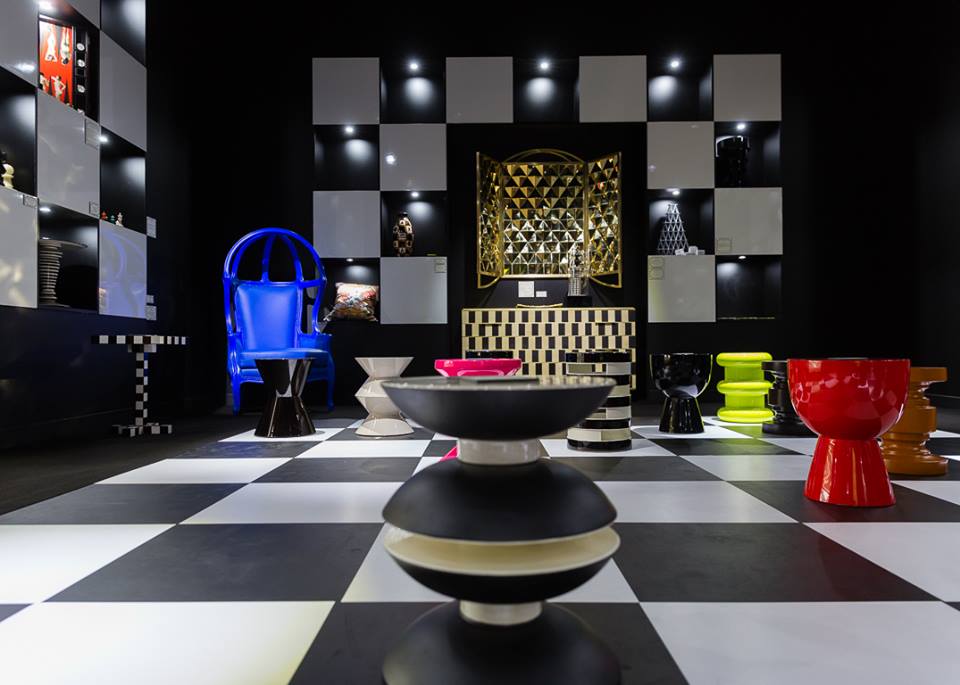
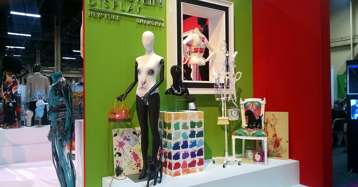
Fortunately, there is furniture that meets both requirements, such as the Neo-Baroque inspired furniture from POLaRT. These pieces are eye-catching and immediately evoke meanings and stories, but due to their monochrome design they don't steal the spotlight from the main object: your products.
For example, in this scene the furniture draws powerfully attention and immediately evokes ideas related to palaces, luxury and sophistication, however, being of the same color range with the background and some props, the objects that really stand out in the scene are the vase, the flowers and the background decoration.
4.- Balance is essential.
Until now we have several elements in the showcase: the products, the decoration and the props or supporting objects. At this point, it's a good idea to refine your scene sketch by applying some basic compositional principles.
Concepts like balance, proximity, alignment, repetition, contrast, and space come into play. It sounds tedious, yes, but this step is important to ensure that the design of the display case will be aesthetic from where you see it.
Of all this, the most important tip you should follow is that the products you want to display must be exactly at the height of the line of sight of the target audience, which can vary depending on whether they are children, adolescents or adults.
On average, the line of sight of people in urban areas ranges between 4.9 and 5.2 ft in height. So that is the desirable height to place the elements that you want to highlight.
5.- Pay attention to the lighting
The end of any showcase is lighting, as it is what will direct attention to certain objects and give joy or drama to your scene. Therefore, avoid generic lighting at all costs and get creative: use spotlights, led strips, fill lights and many other types of luminaires.
One of the best examples we can give you is this beautiful designer galleries display case: notice how the curtains create multiple planes, giving volume and depth to the scene. The central element is a huge indirect light emitter, whose warmth contrasts with the other planes, which seem cold.
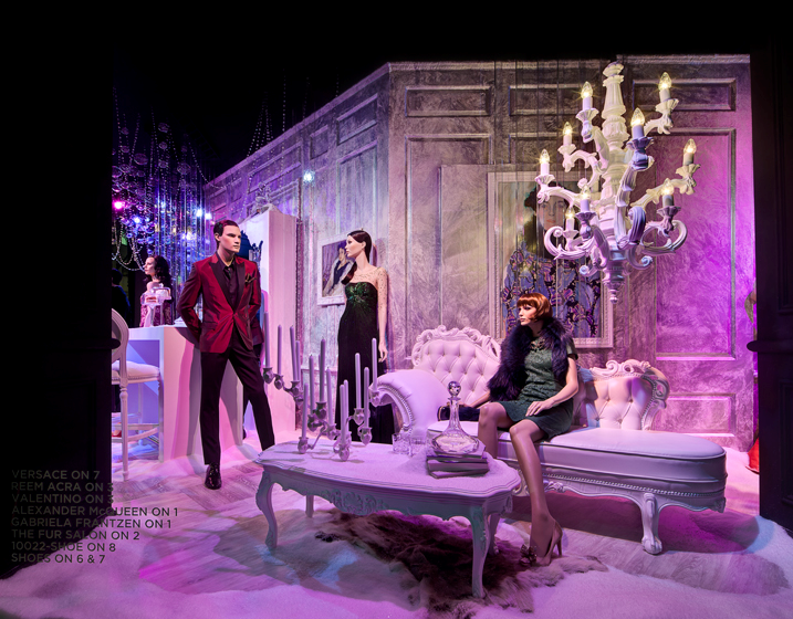
And in the middle of this juxtaposition, there is a mannequin in a dramatic position, dressed in the garments that the designer in turn wants to promote. But despite being in the "cold" part of the scene, the mannequin looks strangely striking, and the reason is that it is being strategically illuminated by a spotlight located in the upper left.
Whenever possible, take an attentive and critical stroll through the sideboards of your nearest shopping center to awaken your creative process by seeing first-hand the state of the art in showcase design.
Large chains of boutiques and retail stores have expert designers, and you can often learn quite a bit from a “simple” display case if you look closely at it.
A well-designed showcase can mark a before and after in the sales of your store. If you are ready to take action, we have excellent news for you: at POLaRT we have a wide range of furniture with powerful visual appeal that will be the ideal complement to your designs.



Leave Comment